

Proposal of a Color Reference Sample as a New Indicator for Investigative Photography
32nd JSCCP Annual Meeting
○S Hamaya
Introduction
In the field of conservation and restoration, investigation photography is often conducted to estimate the materials and techniques applied to paintings. In such contexts, color reference samples composed of painting materials are occasionally employed as visual indicators. Although numerous studies have been published on the creation and application of such samples, structural limitations often make it difficult to position and photograph them under the same conditions as the object during documentation.
Furthermore, creating a systematic color reference sample requires the integration of a wide range of painting materials on a single support, which increases the overall size and complexity. As a result, the construction is time-consuming and resource-intensive, limiting its widespread practical adoption.
This study examines the design and application of a color reference sample that improves usability during photography while addressing the aforementioned challenges. The results indicate that such a sample holds promise as a new reference tool for material investigation, and is thus proposed here.
Background
The color reference sample (color chart) developed in this study was designed for comparative analysis of oil paintings and intended for application in multispectral optical investigations, ranging from the visible spectrum to non-visible wavelengths. Accordingly, issues encountered during various types of optical imaging were examined.
In particular, imaging that relies on excitation light from outside the visible spectrum (e.g., ultraviolet or infrared) often reveals problems in the captured results that are not discernible to the naked eye. For instance, if a material highly reactive to the excitation light is used as the base for the color reference sample, it can interfere with the recorded response of the pigments and even affect the appearance of the artwork itself.
In ultraviolet fluorescence imaging, excessive reflection of visible light unrelated to fluorescence, or light streaks (stray light) within the image, can occur. These issues become more prominent during long-exposure imaging. In the case of pigment samples on paper supports—used as comparative materials for Japanese paintings or watercolors—if the paper base is exposed at the edges, the reflection of visible light induced by the paper can exceed the faint fluorescence of the pigment, often resulting in halation that impairs accurate observation and documentation.
Such interference may also arise when materials with strong fluorescence are present around or adjacent to the pigment samples, not limited to paper supports. In infrared imaging, if highly reflective materials are exposed at the periphery, strong infrared reflection can exceed the sample response and affect observation. Moreover, materials that cause no issues in visible or ultraviolet fluorescence imaging—such as black or dark-colored substrates—may reflect strongly in the infrared range.
To address these challenges, the color reference sample developed in this study eliminates exposure of non-sample areas on the imaging surface and uses a base material with minimal reactivity to non-visible wavelengths, thereby minimizing interference during multispectral imaging.
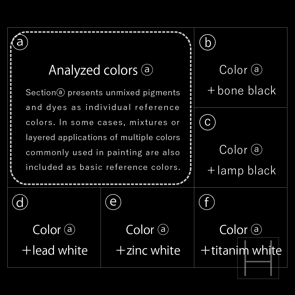
Diagram 1.
The diagram above illustrates the arrangement of colorants on each color reference sample (color chart). The target pigment or dye (a) is placed at the center, while surrounding areas are filled with mixtures of colorant a and representative black pigments (b, c) or white pigments (d, e, f). The mixing ratio of a to the added pigment was set at 3:1 in most cases. The selected colorants include a range of pigments and dyes used historically from classical to modern periods. For comparison with the OPD color reference samples, pigments supplied by Zecchi (Italy) were used, with stand oil as the binding medium. Each sample was prepared on an independent base material measuring 6 × 4.5 cm² and can be freely selected and arranged according to the needs of documentation or analysis.

Diagram 2
The diagram above presents a cross-sectional view of the structure of the color reference sample (color chart). The top layer (1) consists of the pigment and binder sample layer, which is uniformly applied onto Base Material A, a canvas. For broad applicability in comparative analysis, a standard commercially available oil painting canvas was selected. To assess infrared transmission through the sample surface, underdrawing lines in pencil and charcoal—commonly used materials—were drawn on the canvas. For Base Material B, a dark-toned neutral paperboard was employed to reduce handling risks during imaging and minimize impact on the artwork. After drying, each sample layer was adhered to the base to prevent physical or chemical interference with adjacent samples.
Following the preparation of the color chart, imaging was conducted under visible light, ultraviolet-induced fluorescence, reflected UV, reflected infrared, false-color infrared, and multispectral UV false-color modes[*3]. The resulting image data are shown below.
Background and Review of Prior Research
Leading up to this study, we have reproduced various previously published color reference samples and collected imaging data using them. Among these, the most significant reference was a paper published in issue no. 8 (1996) of the Restoration Annual Report by the Opificio delle Pietre Dure (OPD) in Florence, which discusses the creation of color reference samples made from painting materials for optical analysis purposes[*1].
The samples presented in that publication systematically reproduce the materials and techniques used in traditional Italian paintings. In addition to pigment samples prepared with drying oils and egg tempera as binders, the set includes various binders and restoration materials. It comprises approximately 500 samples, including layered and mixed configurations of pigments and binders. We reproduced these color reference samples and conducted optical imaging used in the field of conservation and restoration, collecting photographic data[*2] [*3].
During this reproduction process, several technical issues were identified. The OPD samples were applied in ten different materials on a traditionally primed wooden support, arranged side-by-side. However, it proved difficult to apply each sample within its designated area without interference, and differences in binder absorption and drying speed during the drying process led to physical and chemical contamination between neighboring materials. Creating multiple samples without gaps on a single substrate involved technical and temporal limitations, and required significant time for reproduction.
In addition, the imaging results can be affected by material degradation over time, making it preferable to apply all samples with minimal time lag. Even when a well-constructed set of samples is created on a single support, it may not be suitable for all target artworks. Moreover, such a large format requires more space within the photographic frame, limiting versatility.
Furthermore, the OPD samples are based on classical Italian painting techniques, and therefore were found to be of limited usefulness as indicators for artworks commonly examined in Japan.
Considering these issues, the present study adopts a modular structure (see Diagram 3), in which each material (colorant) is formed as an independent unit. This approach improves technical issues during sample preparation and allows for greater flexibility in selecting and arranging material samples suited to each target artwork at the time of imaging.
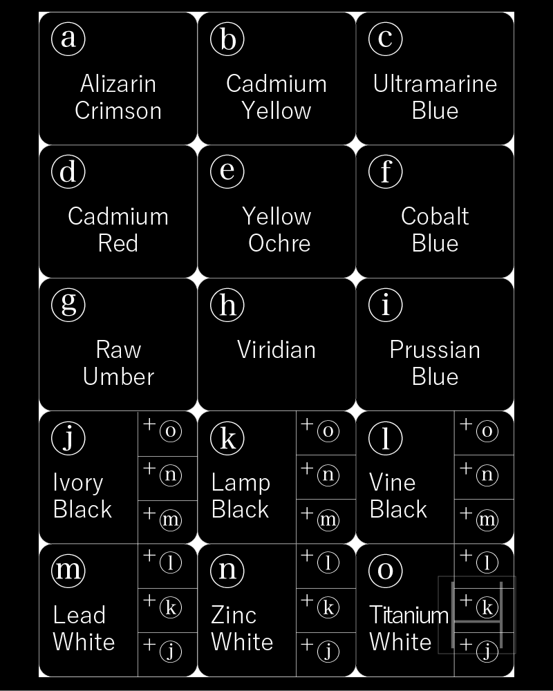
Diagram 3: Color material arrangement diagram of the color reference sample
For the color reference samples produced in this study, fifteen basic colors frequently used in general painting techniques were selected. Each sample was constructed according to the structure shown in Diagram 1. Note that the samples for black and white pigments differ in their configuration; the arrangement of mixed tones is therefore shown in the figure on the left.
Based on the imaging results, the effectiveness of these samples as reference indicators was confirmed. Moving forward, we plan to create a systematic set of color reference samples composed of pigments ranging from classical to modern.
Since the combinations and layering patterns of pigments used in painting techniques are highly diverse, we will continue to test their effectiveness as indicators while expanding the range of variations. In addition to the oil paints made with drying oils used in this study, we also plan to produce color reference samples using water-based binders.
Given that the response characteristics of the samples are expected to change over time due to aging, we will conduct periodic imaging to document the progression of these changes. Furthermore, by comparing the samples with the artworks under investigation, we will aim to enhance the effectiveness of the reference samples through ongoing improvements to their structure and composition.
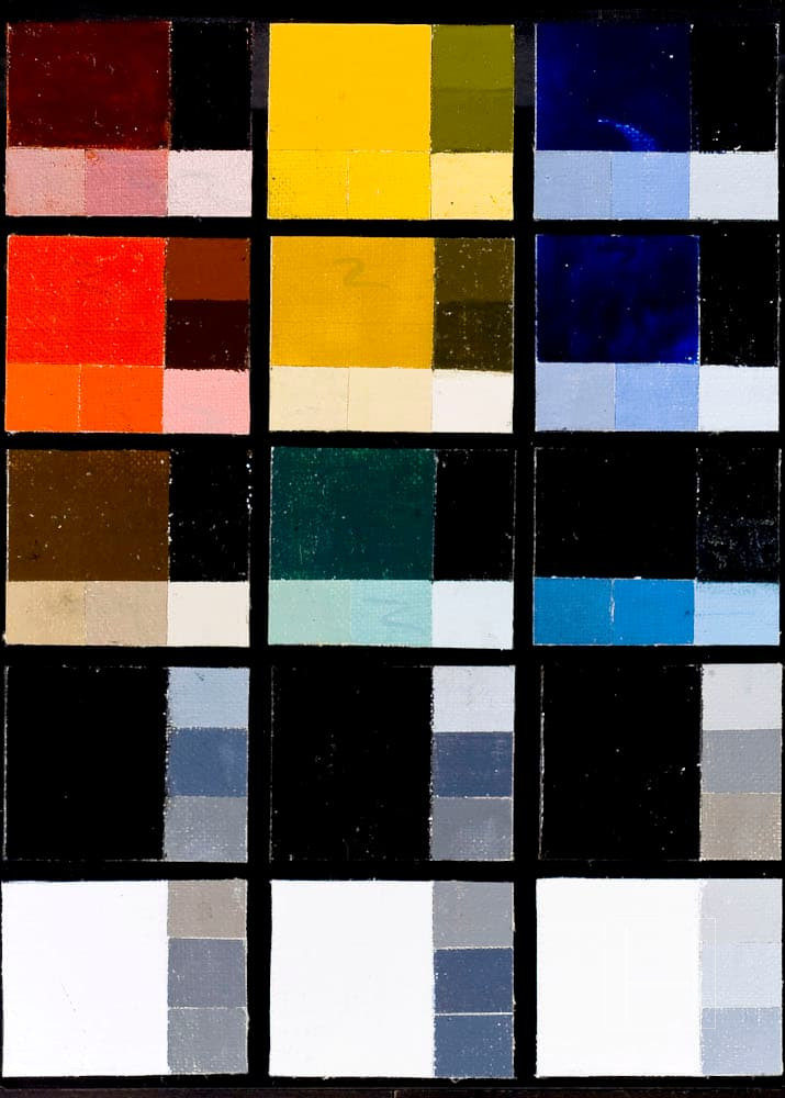
Figure 1. Visible light image
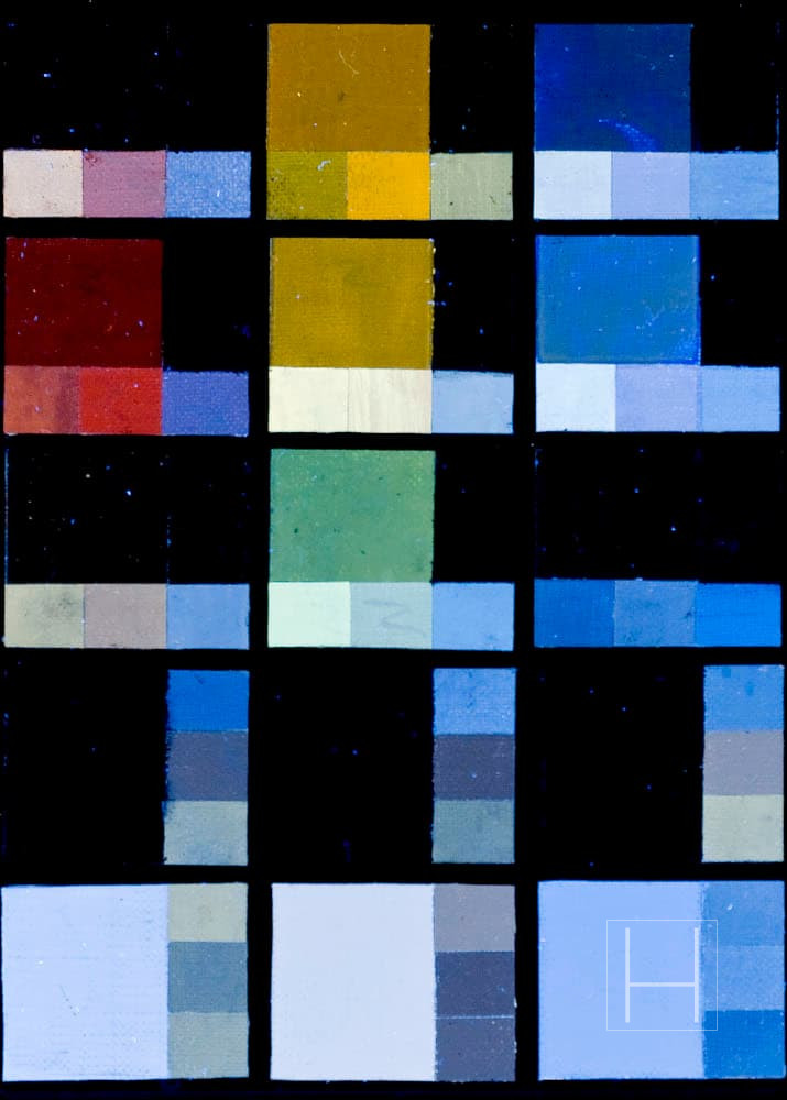
Figure 2. Ultraviolet fluorescence image
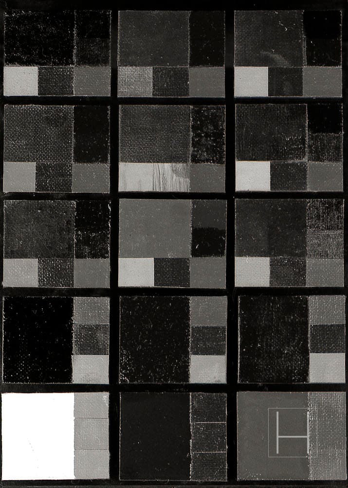
Figure 3. Reflected ultraviolet image
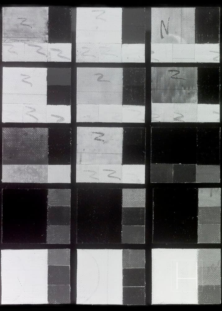
Figure 4. Reflected infrared image
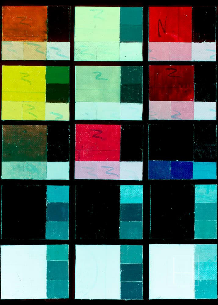
Figure 5. Infrared false color image
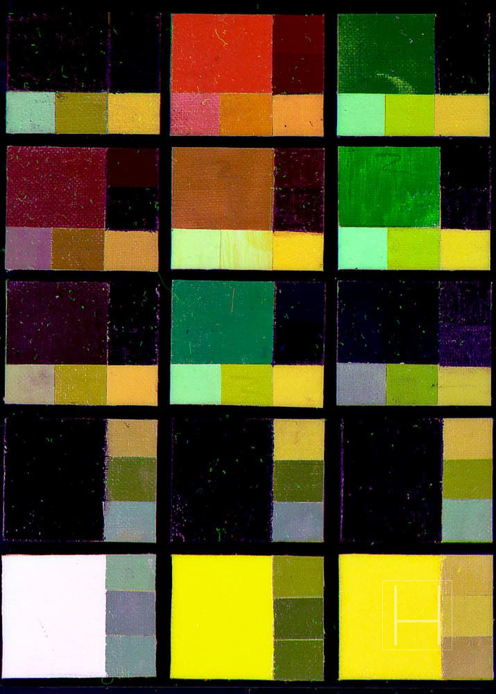
Figure 6. Multispectral Ultraviolet False Color Image
| Image | Applied Filter | Light Source |
| Photo 3. Visible light image | B+W UV/IR-CUT | Profoto Pro 5 PB head 1500W: x2 |
| Photo 4. Ultraviolet fluorescence image | Kodak Wratten No.12 + B+W UV/IR-CUT | Toshiba FL20S BLB 20W: x4 |
| Photo 5. Ultraviolet false color image | B+W UV/IR-CUT (Visible component) | Profoto Pro 5 PB head 1500W: x2 |
| Hoya U-360 (UV component) | Toshiba FL20S BLB 20W: x4 | |
| Photo 6. Infrared false color image | B+W UV/IR-CUT (Visible component) | Profoto Pro 5 PB head 1500W: x2 |
| Kodak Wratten No.87 (IR component) |
Kodak DCS760/ Tochighi Nikon UV 105 mm *
This article is based on the research titled “Proposal of a New Color Chart as an Indicator for Survey Photography,” presented during the poster session at the 32nd Annual Meeting of the Japan Society for the Conservation of Cultural Property (June 12–13, 2010, Nagaragawa Convention Center). It has been restructured and published by the author for non-commercial informational purposes.
References
Aldrovandi, A., Buzzegoli, E., Keller, A., Kunzelman, D.
Il falso d’autore indagato con tecniche non invasive. Rapporto preliminare sulle indagini svolte in Santa Maria della Scala di Siena durante la mostra “Falsi d’autore”, OPD Restauro, No. 17, 2005, pp. 265–272.Hamaya, S., Fukasawa, K., Matsuzaki, M.
“A Practical Color Reference Sample for Optical Analysis,” Proceedings of the 29th Annual Meeting of the Japan Society for the Conservation of Cultural Property, 2007.Hamaya, S.
“Proposal of a Pseudo False Color Image Based on Ultraviolet Fluorescence and Multispectral Imaging,” Proceedings of the 31st Annual Meeting of the Japan Society for the Conservation of Cultural Property, 2009.